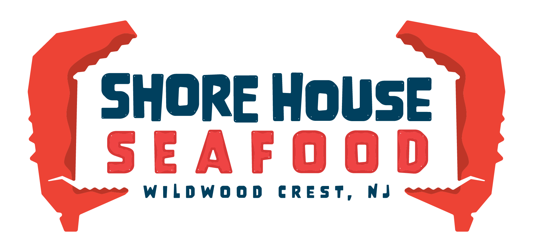
Shore house Seafood
Visual Brand Identity

PROJECT: Shore House Seafood Brand Design
AREA OF FOCUS: Branding and Logo Design
DATE: 2024
BACK STORY: Create captivating a brand design for a coastal seafood restaurant in Wildwood, NJ. The designs should be geared toward families coming home from the beach after a fun day in the sun looking for some fresh seafood to take home and enjoy.
It was important to the Shore House Seafood brand that the logo showcase some kind of crab iconography as it’s always been a family favorite and will be a featured item in the restaurant. During the research phase, I noticed tons of repetitive crab imagery in logos, but I wanted to do something different, something more creative.

As with all branding projects, it’s important to have color variations that can work in all different mediums and scenarios. The red had to stay in the claws so the only other way to create a variation was to invert the white and blue. In this case, it works well because the blue background also matches the blue of the ocean backdrop of the East Coast.

Since the location had an existing sign it made sense to design a logo variation for that specific shape. The benefit of a modular logo design is that it allows the logo to be deconstructed and reconstructed into different shapes for versatility and use in all different circumstances.


I designed the negative space of the crab claws to form a house. The overexaggerated shape of the claws also makes the logo more playful and inviting to families which is their target audience.

With any good brand in the age of the internet, having a round version of your logo is important. These variations still resonate with the main logos while being simple enough to be clear at such small scales.


The colors were somewhat challenging to hone in on at first. It was always obvious I needed a red, but then it came down to which shade of red and which colors corresponded best to that red. Not knowing which pallet would fit the brand best, I created a ton of variations to check. I tried faded tones for a homier feel and bright tones for an excited feel and finally settled on deep, but vibrant red and blue. The final red and blue paired with the white also tie into the shore town’s rich American history as well as the colors of the US Coast Guard which has a base not far from their location.

After I just mentioned how important it is for logos to be optimized for a phone screen, a brand’s logo should still be able to be used in the archaic ways of print. This is important for documentation, invoices, receipts, and so much more that is still limited in detail and color. Because of these uses, I always make sure there are logo variations that work as at least one color and ideally in black and white.


