

Visual Brand Identity and Logo Design
for HAPA KITCHEN
PROJECT NAME: Hapa Kitchen Brand Development and Design
BACK STORY: The Owners of Aloha Aina food truck in Columbus, Ohio wanted to start a new food truck concept, but they need to build the brand from the ground up. Throughout this project, I designed the brand logo, chose the complementary colors and fonts, designed textures and patterns, and also designed the entire truck wrap/livery.
OBJECTIVE: Build an mixed modern and traditional visual brand identity around Hapa, “meaning mixed with Hawaiian descent”, and design a food truck wrap/livery.
VISUAL AREA OF FOCUS: Branding and Logo Design
DATE: 2022
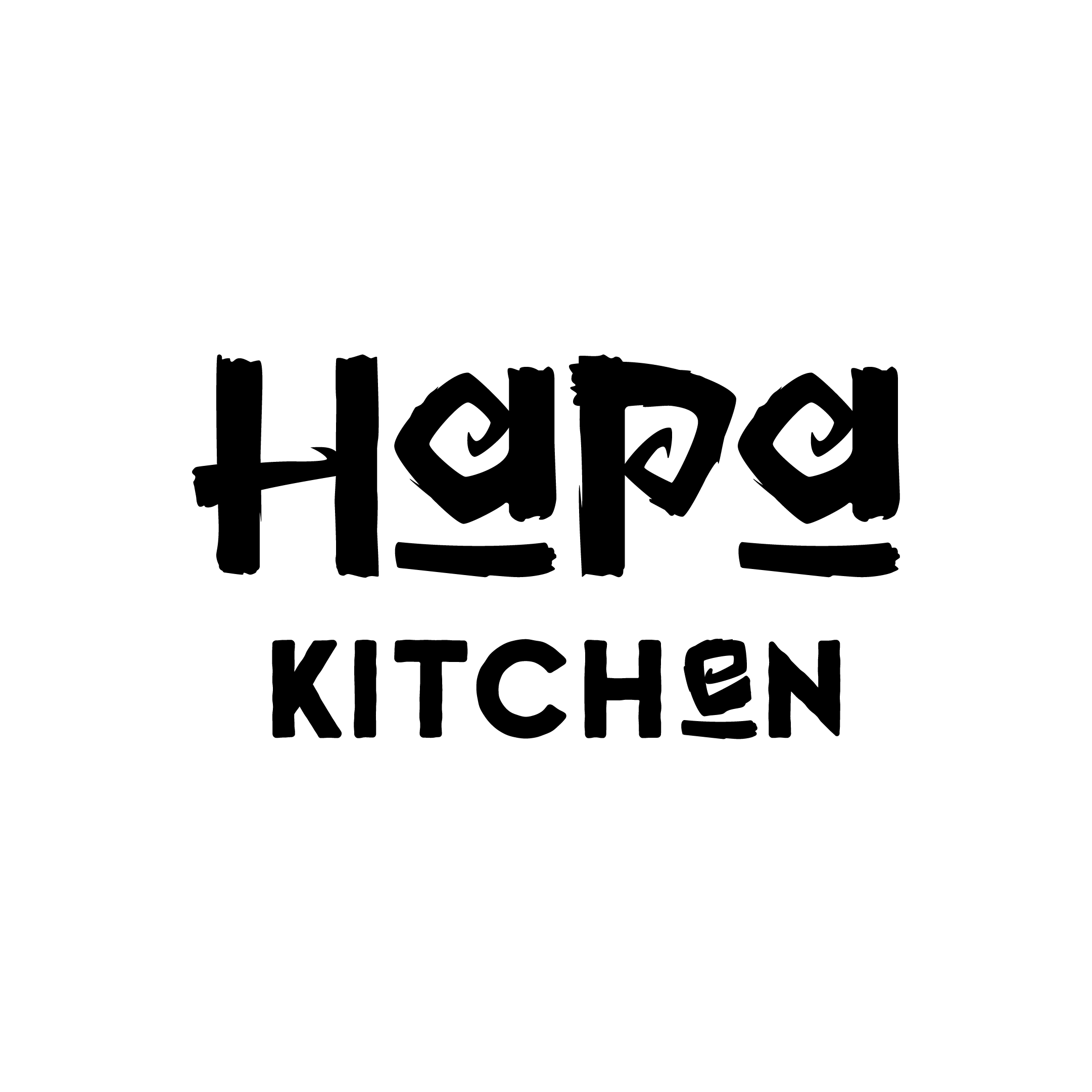

Originally, I leaned more traditional feel for the first draft of the logo to convey the Hawaiian roots and mindset of the brand. We really liked the stacking of the “ha” and “pa” and the symmetry they seemed to have. But we decided to steer a little more modern for the brand to appeal to a more modern-focused audience.


We kept the stacked Hapa logo but decreased the details and simplified the type as well as made custom letters that accentuated the symmetry. The lowercase name is meant to convey a chill and relaxed tone to meld with traditional Hawaii values.

Originally, the Hapa team wanted a “shaka” hand symbol in the logo, but later in development, we shifted gears to a geometric turtle included in the long form of the logo. Due to size, there are specific times and places for this version of the logo. This is one of the benefits of having multiple logo variations. There are ones with images, ones with just the word mark, vertical, horizontal, etc, etc!
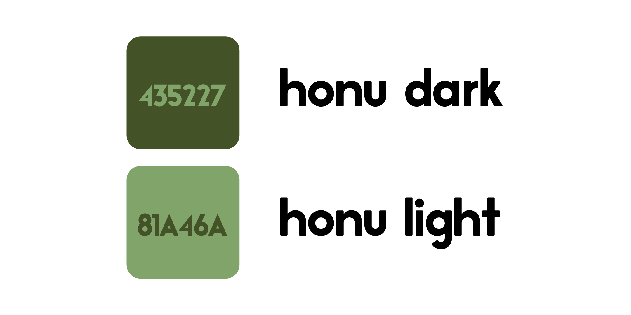
One thing I always do during a logo development, is design strictly in black and white to start with. This allows me to design within the constraints that sometimes the logo will be seen only in black in white. We wanted the brand colors to feel earthy and natural like the ingredients the Hapa truck would be using. The colors we chose were variations of green like the shell of a Honu turtle.

Something I learned on this project that I will be considering every project going forward is the WCAG AA and AAA Accessibility Criteria. This improves accessibility of the brand for those who may see colors differently. As you can see, the two main colors pass for both icons and larger text. On smaller text, Hapa kitchen will use either black on white or the honu dark on white.
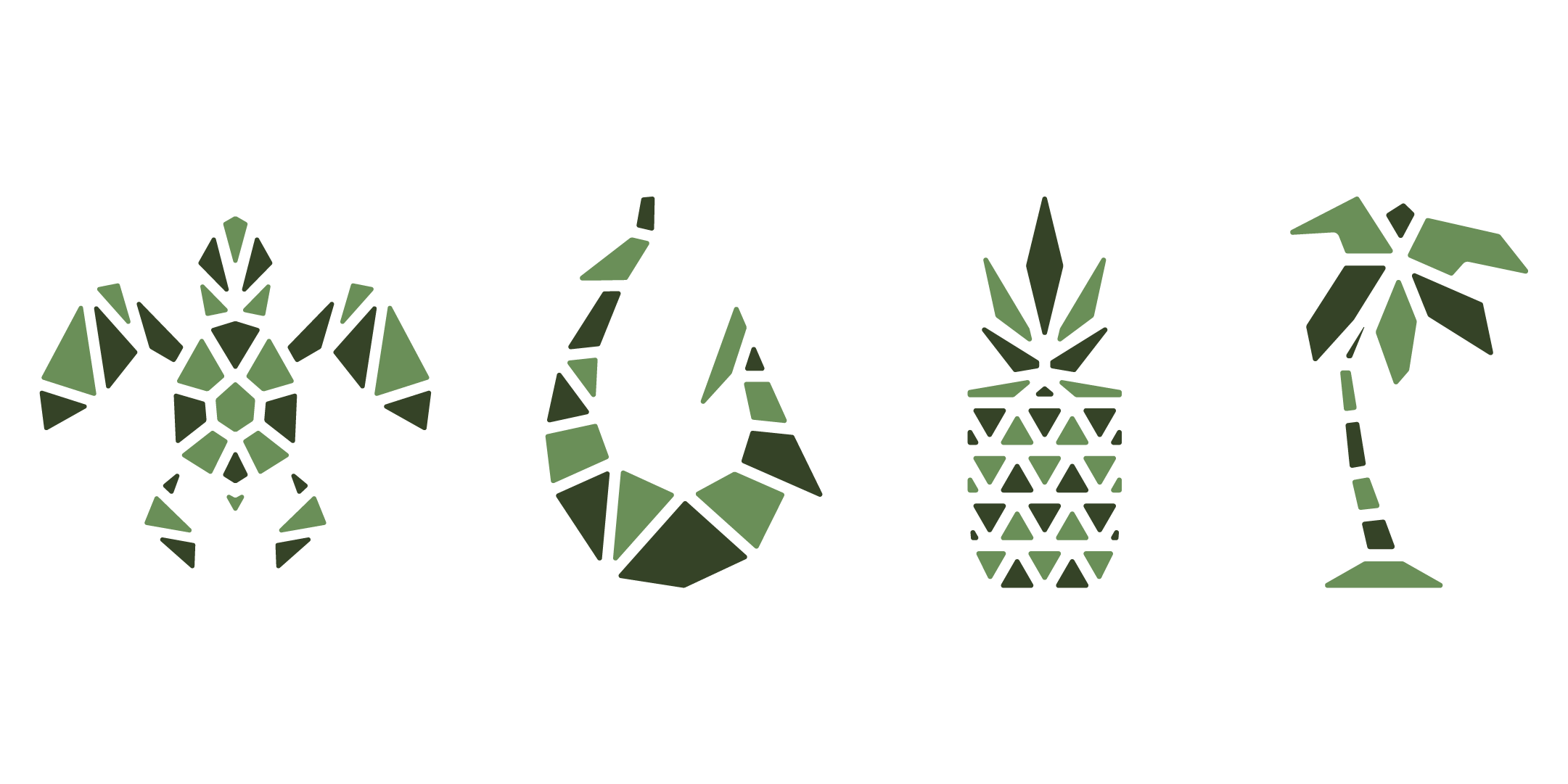
No brand is complete without accompanying brand icons and elements. These are useful for limitless applications such as on printed marketing materials, social posts, apparel (swag, merch drip, whatever it is in your generation lol), and much more! Designing brand icons helps to reinforce the consistency and cohesiveness of the overall brand image.

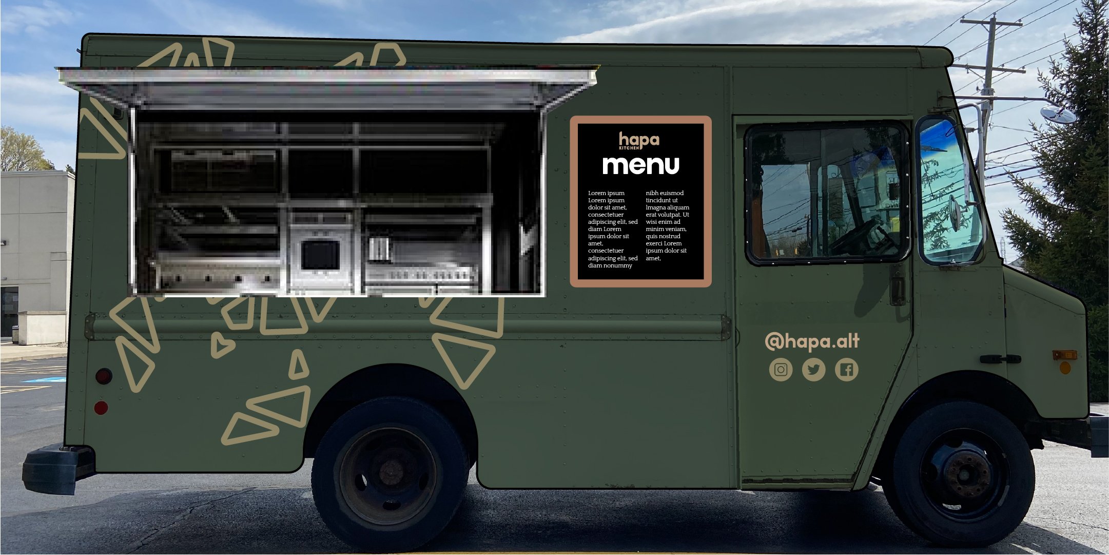
Once I wrapped up all the digital brand designs, I moved on to designing the truck wrap, otherwise known as a livery. After a couple setbacks and changes we finally have a final truck to see! Check out the Hapa kitchen instagram to follow along with their journey and see more photos of their food and their new truck!
I hope you enjoyed following along with the project! It was a great project for even better people. I wish them all the best and can’t wait to see the truck driving around as a reminder of the designing that went into making this a reality. If you’ve got a brand and need some graphic design, logo design, or anything to improve your brand’s visual identity, reach out and let me know!