

HAFLER HANDWORKS
VISUAL BRAND IDENTITY, PHOTOGRAPHY & VIDEOGRAPHY

PROJECT: Hafler Handworks Brand Development and Content Creation
AREA OF FOCUS: Branding, Logo Design, Photography, and Videography
DATE: 2023
BACK STORY: Owen Hafler is a wood worker and furniture maker located in central Ohio. He operates on a local level but wants to get his name out there and do more projects where he can put his wood working skills to good use. His brand image is hard work paired with attention to detail. Owen believes strongly that the work should speak for itself so we worked together to develop a brand identity and logo that matched his amazing work. He also needed content to fill out his website and social media accounts so we created photos and videos to highlight his skills and attract new clients.


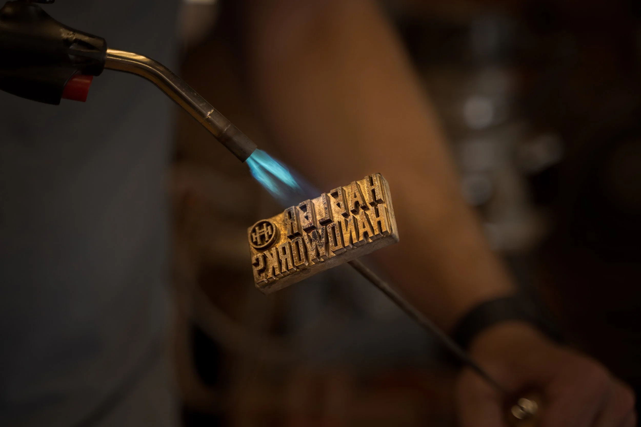


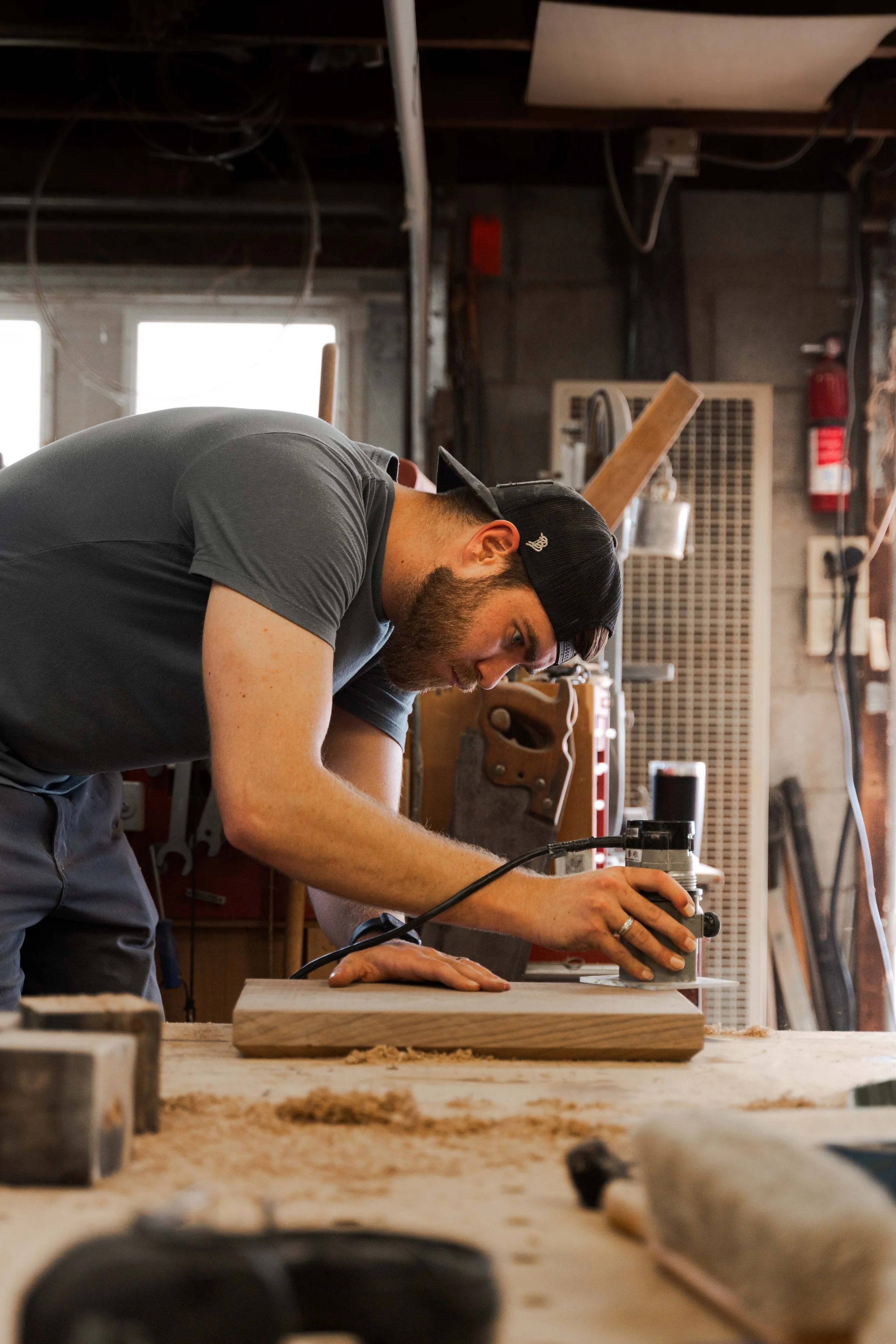

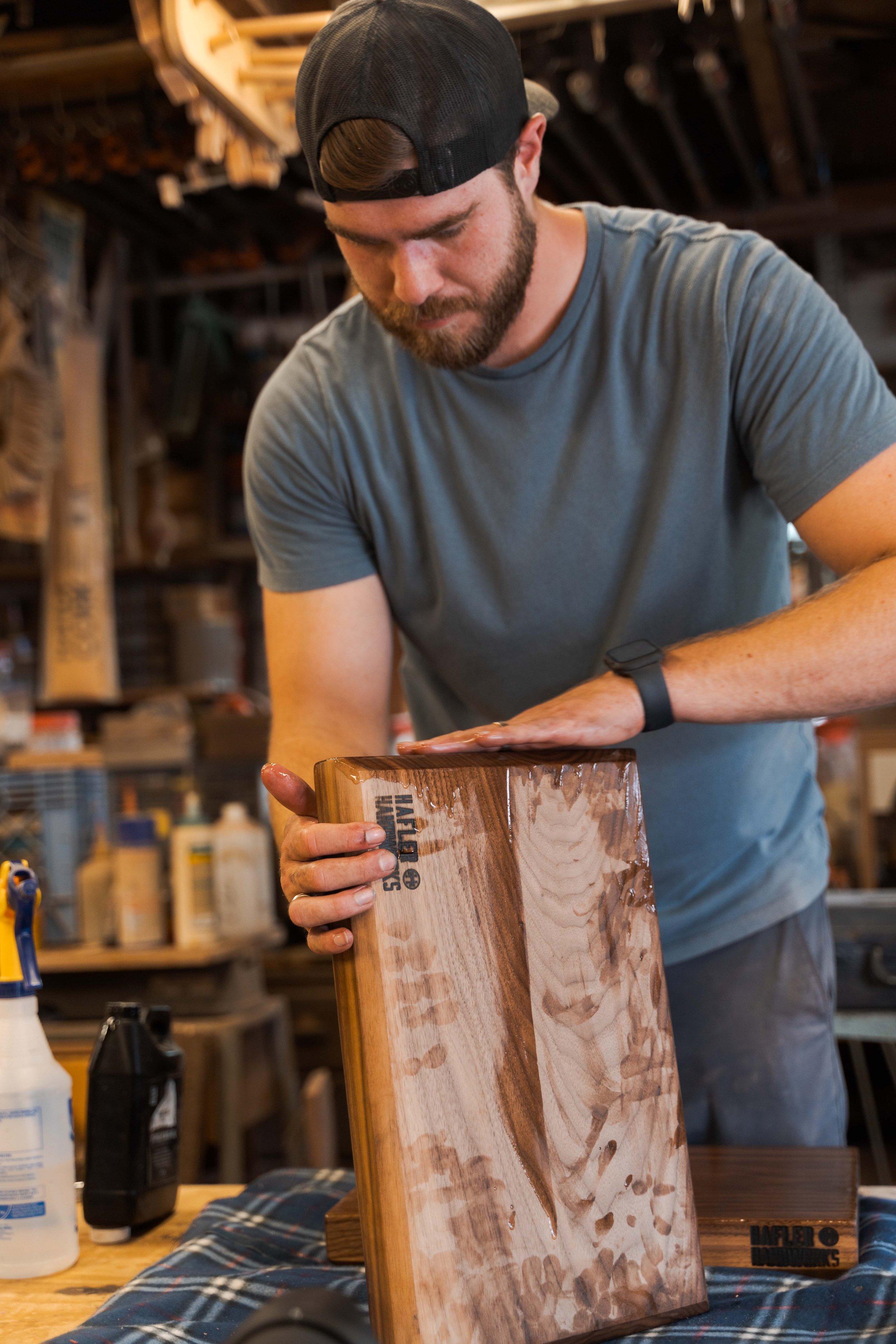


The photo content for Hafler Handworks is meant to show off Owen’s skills as a craftsman as well as his attention to detail and hard work that he puts into every project. Every project that Owen finishes isn’t ready until it has his stamp or approval, literally. These brand photos are also intended to showcase Owen’s vast capabilities and knowledge and mastery of all the tools in his shop’s arsenal.
To reinforce his brand image, this promo video highlights Owen’s skillset as a wood worker. Owen is skilled but still humble and would rather “Let the Work Speak for Itself” which is where the title came from. I created it in black and white and without music and special sound effects so that the focus is truly on the work itself, an idea I had got from chatting with Owen on the day of the shoot.
And no brand is complete without a full brand identity. Built from the ideas that Hafler Handworks should be a modern, industrial brand, Owen’s brand is uniquely suited to him and his work.

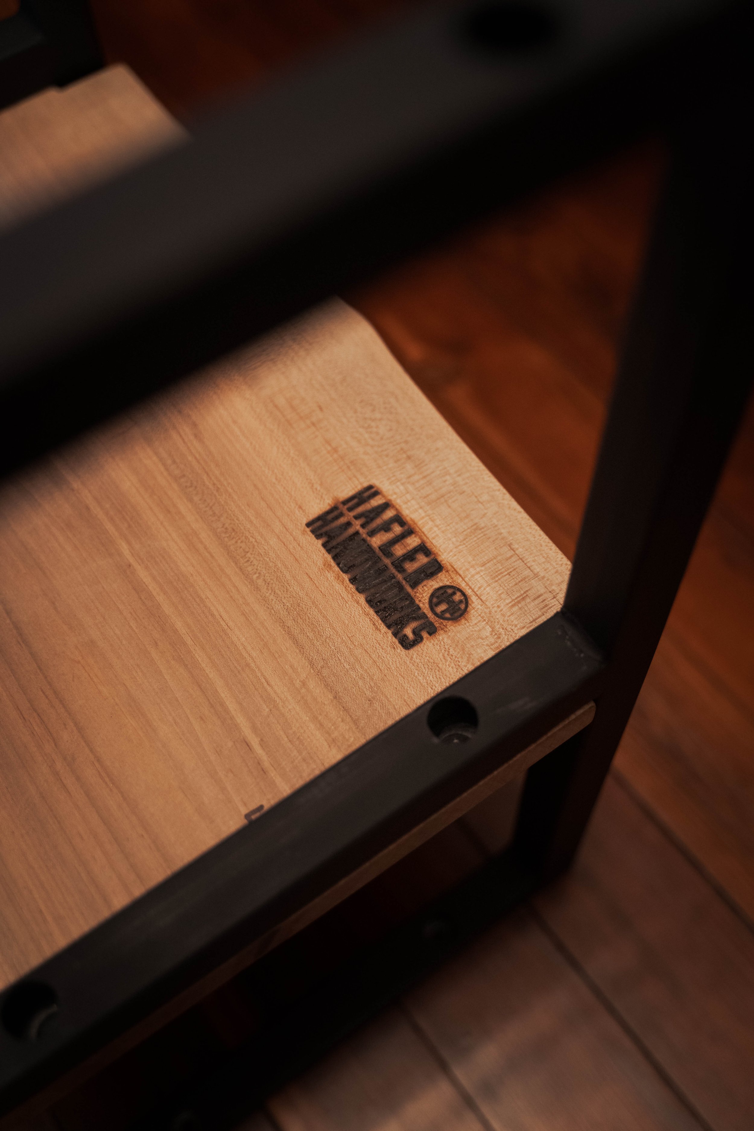
The main logo is a monogram “HH” for Hafler Handworks encompassed within the outer edge trunk of a tree as can be seen with the partial concentric tree rings on both left and right sides. The “HH” itself has small wood grain details to reinforce what kind of work Hafler Handworks does. The last detail, the words “Ohio Made” is a nod to Owen’s origins in central Ohio where he was born and raised.


Based on the brand’s goals, personality, and industry, the brand colors were chosen as the five color colors above. A variation of a navy blue, an auburn, a mix between yellow and white (which I affectionately call “Sawdust”), and solid black and white.


As with most of my logos, I try to build it out so that there are parts that can be added and removed to fit each space and use. There are two variations of the main logo: a word mark with a smaller and simpler HH monogram and the HH monogram itself in a simplified circle. Each one has their own specific use. The work mark is used when Owen etches or brands his logo into the wood piece he finishes and the singular monogram can be used as an app icon, a favicon for website, or for any other situation where small details will get lost.