
CITYWIDE THREAD CO.
BRANDING & PHOTOGRAPHY

PROJECT: Citywide Thread Co. Visual Branding Creation and Photo Content
DATE: 2024-2026
AREA OF FOCUS: Visual Branding, brand product photography
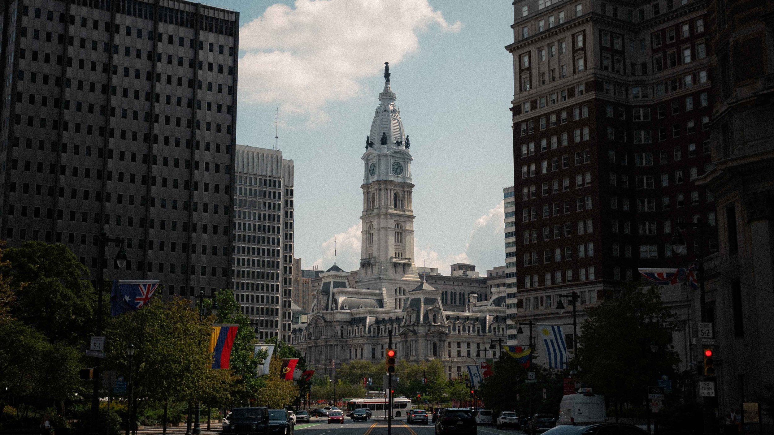
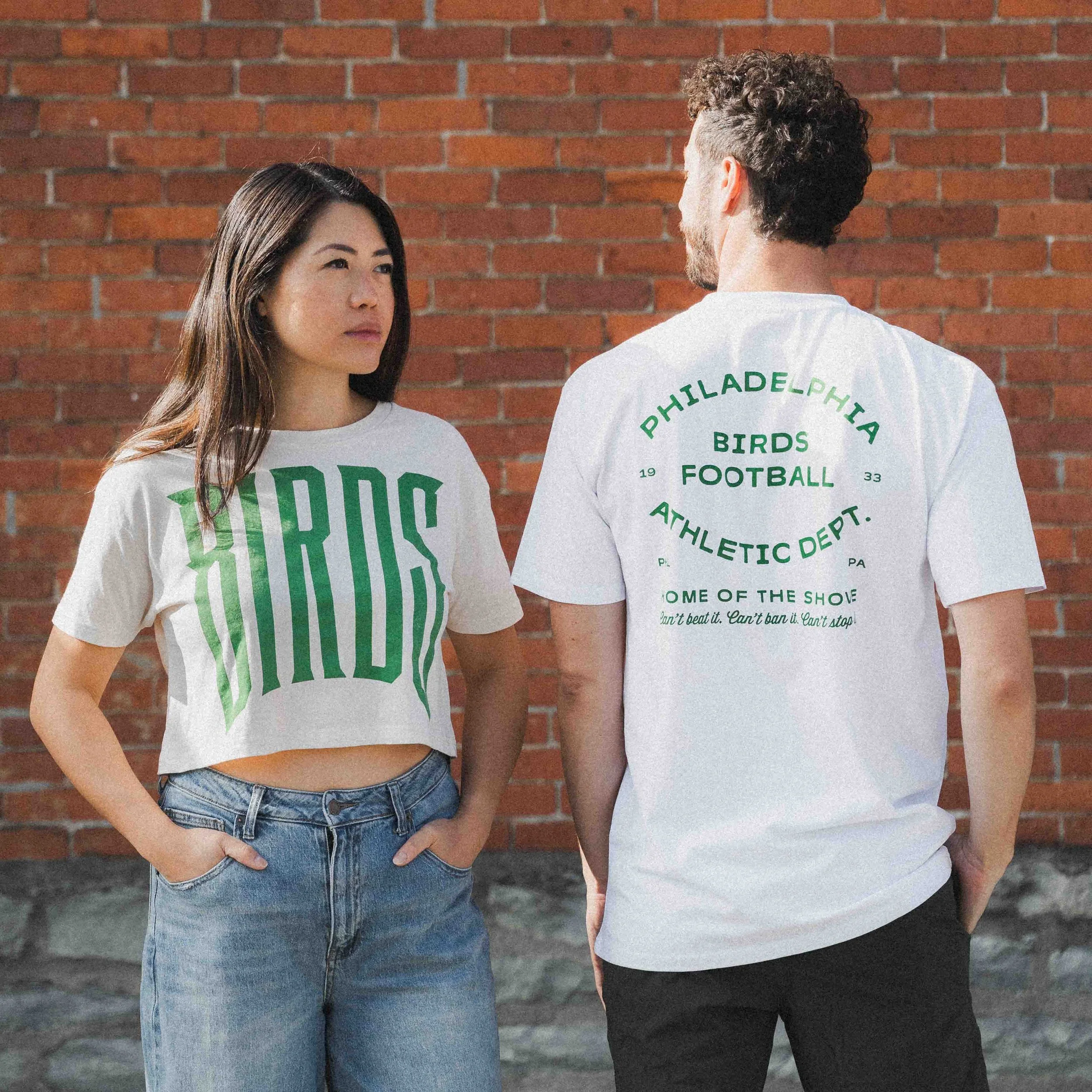
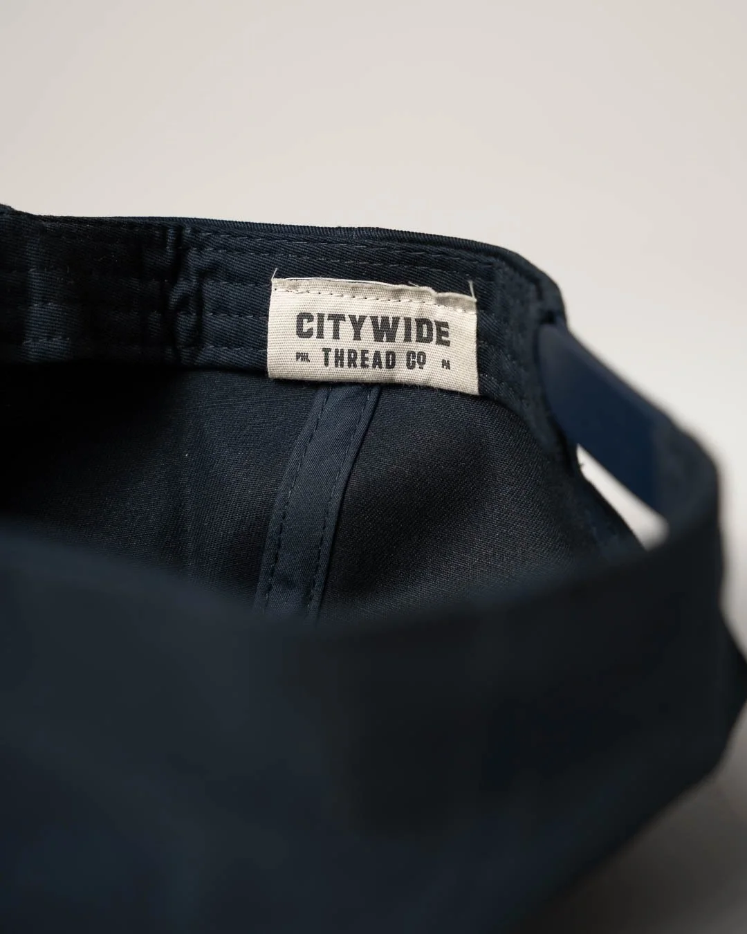
BREAKDOWN: Citywide Thread Co. is a Philadelphia-focused premium apparel company provides a high quality product that is uniquely designed and responsibly made. Their primary style is a mix between vintage, timeless, and iconic with a dash of Philadelphia grit. Citywide needed a visual identity that was immediately recognizable as something Philadelphia based and versatile enough to work on digital and print mediums. They also required high quality photos to match the high quality of their products.
The Logo: Start with a Strong Foundation
As with many brand identity projects, I’ll start off here with building the logo, color pallets, and fonts. All based on research and diving deep into the ethos of the brand.
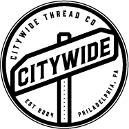
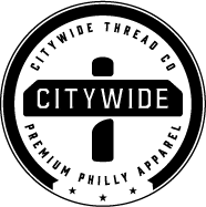

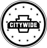
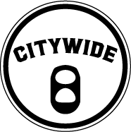
Fig. 1-4: These are just a few of the dozens and dozens of logo marks and word marks that I tested to hone in on the backbone of the visual brand identity.
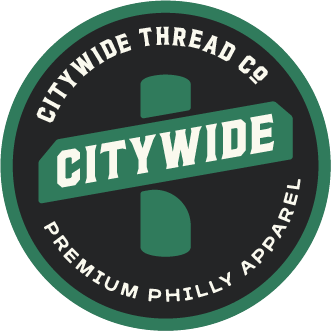
Fig. 5-7: Three variations of the final logo that make the logo adaptable in different sizes and situations.
Colors that tell a story


There were so many options to consider when choosing a color pallet for Citywide. Ultimately, it came down to these three which represent the city’s past, present, and future.
TAILGATE NOIR: a dark gray known to those who pour their hearts into their drinks before the big games and would die defending their team
REBEL PARCHMENT: a vintage seasoned off-white that has stood the test of time and declares to all Philly’s place in history
BROAD & MARKET: the heart of Citywide starts Billy Penn and expands throughout the city. If you ever get lost, look for that iconic green street sign to guide your way
type matters
I chose three fonts that complement the story that has been built so far. History, pride, and a little grit.

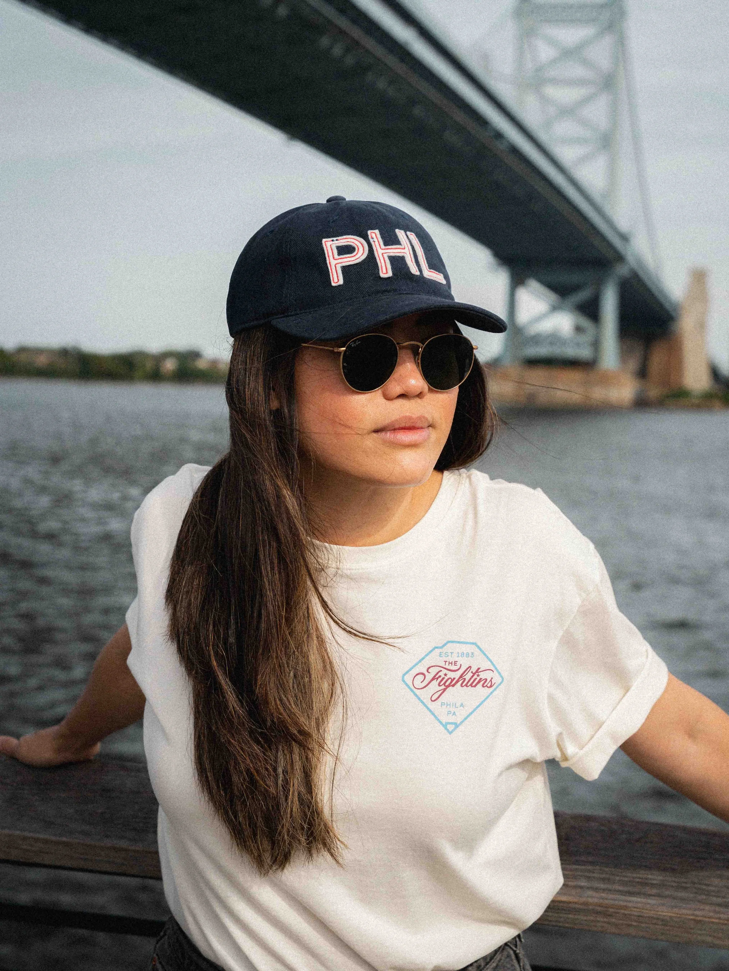
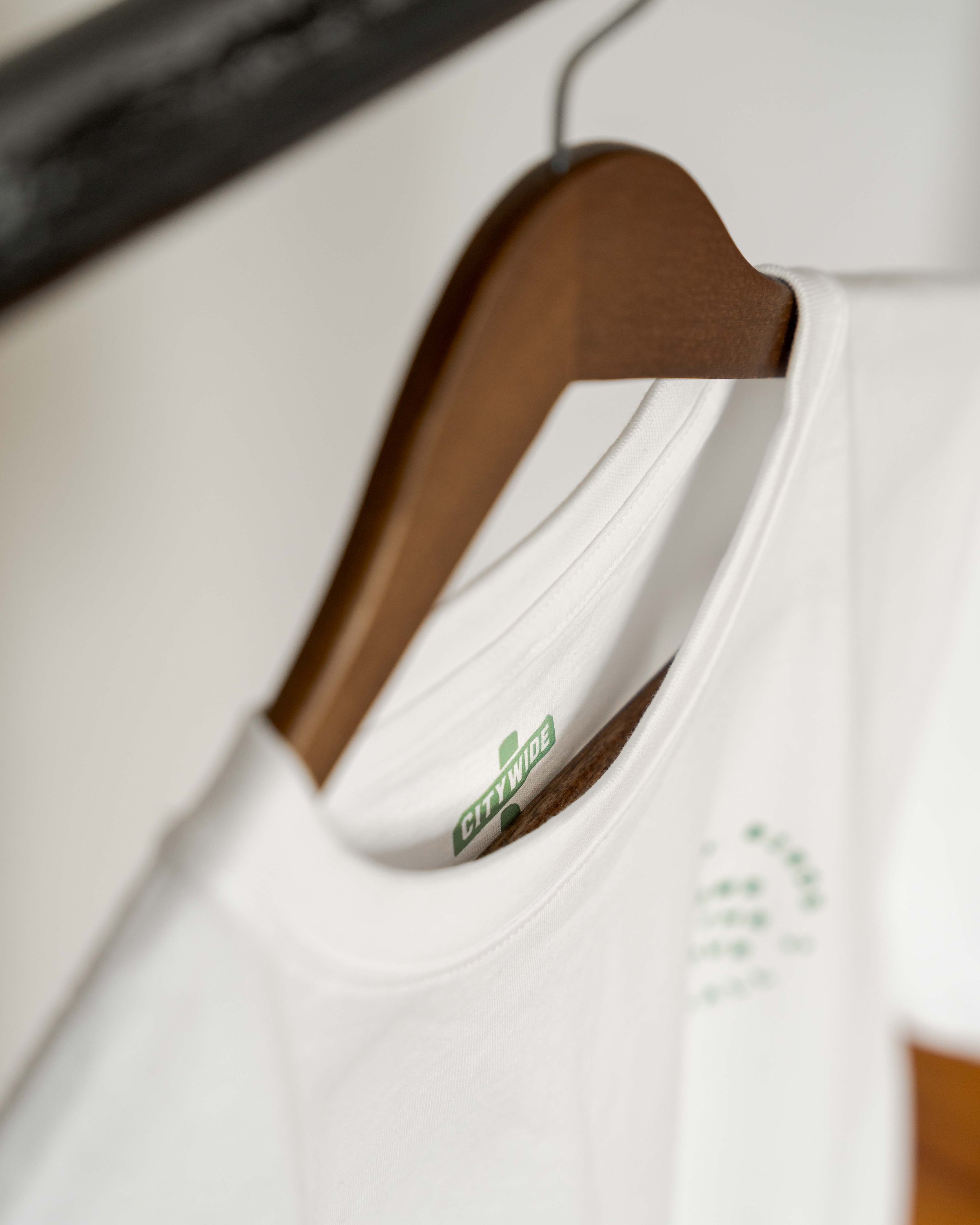
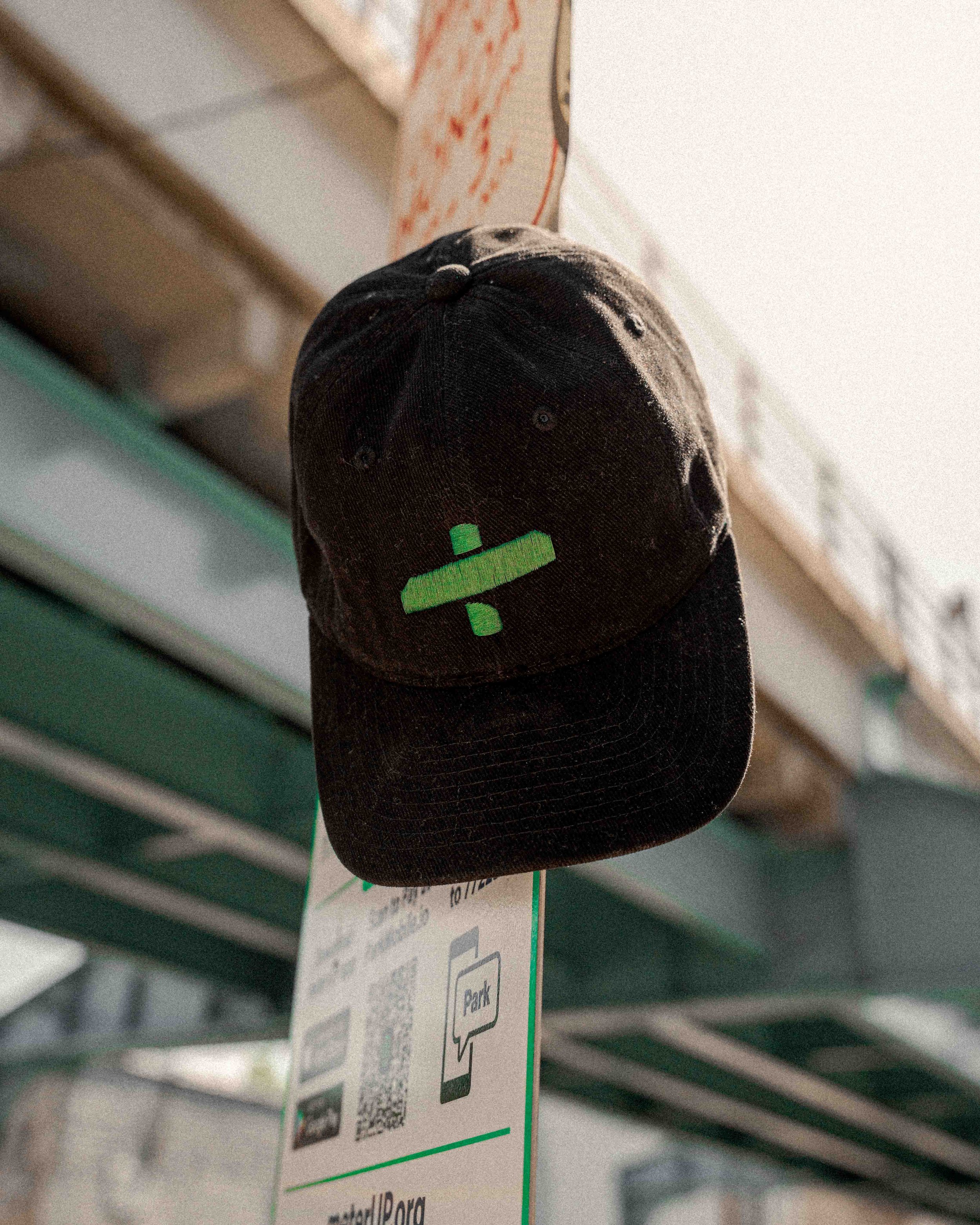
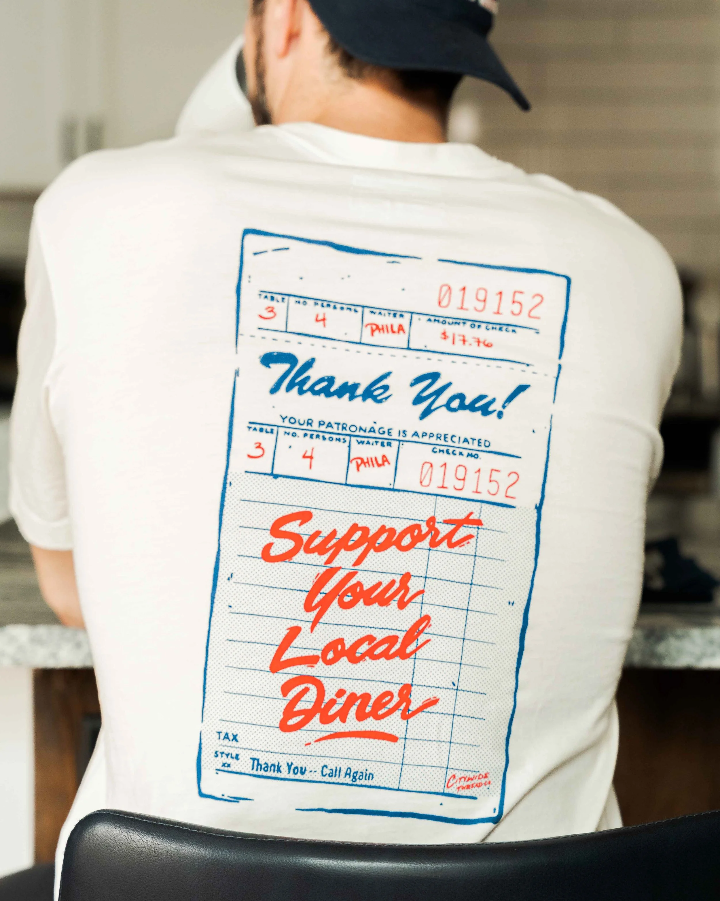
High Quality Apparel Needs High Quality Photos
Building the brand identity was actually just the beginning.
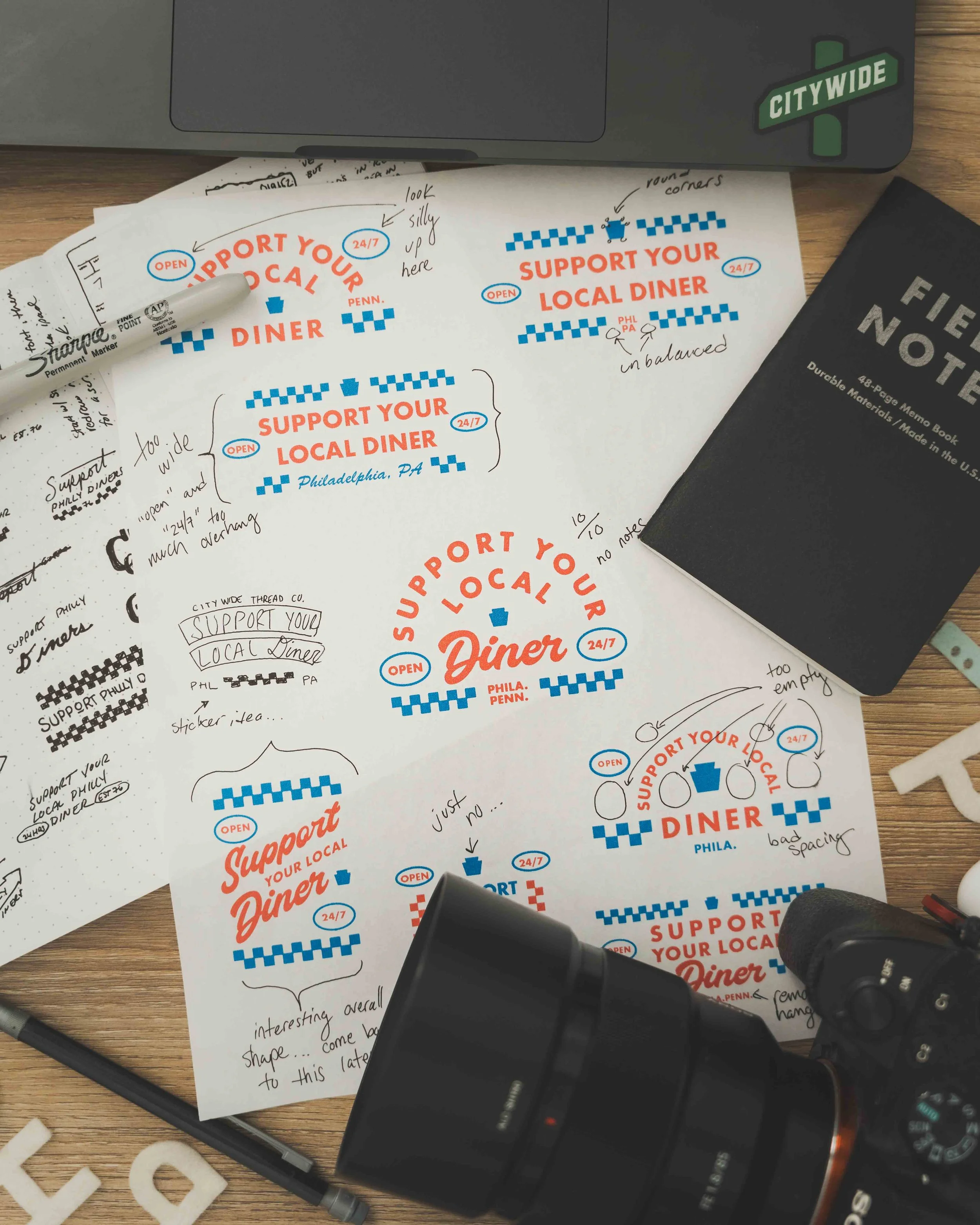
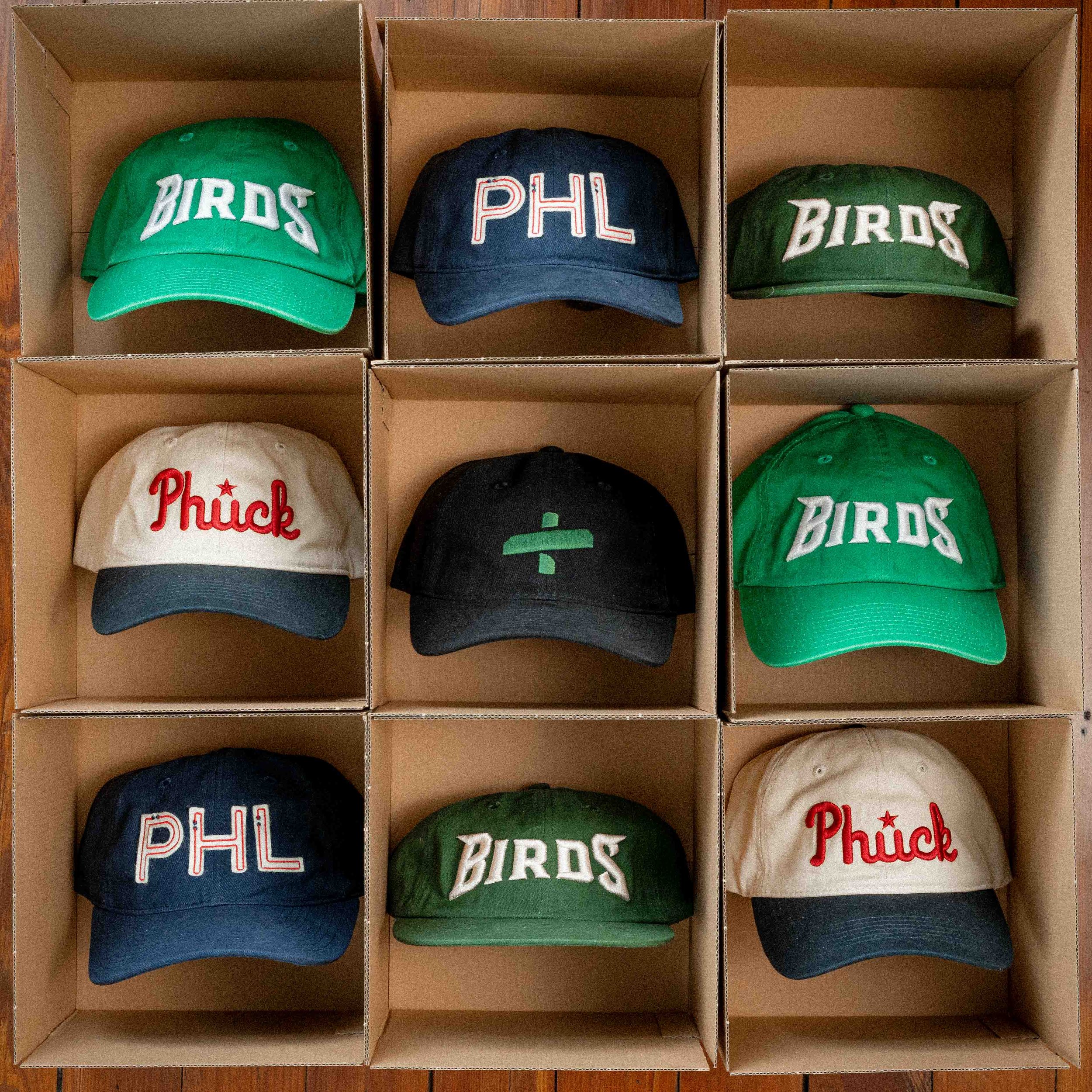
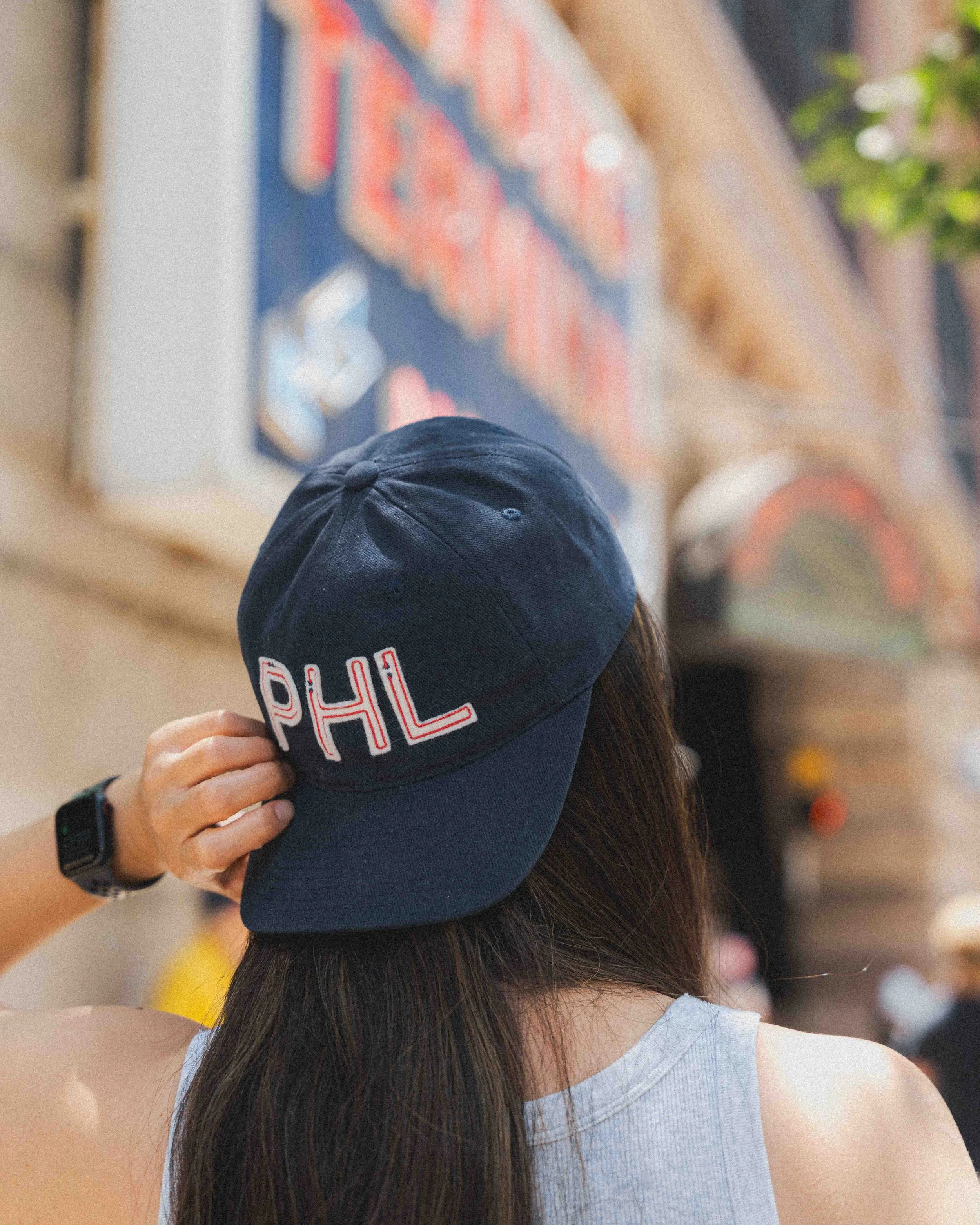
Once the visual branding was on solid footing, it was time to start developing some graphics and designs that would go into the apparel pieces. All designs are focused on Philly sports, culture, and history, and maybe a combination of all three. From stickers to hats, and everything in between, everything had to feel cohesive and stay on brand.
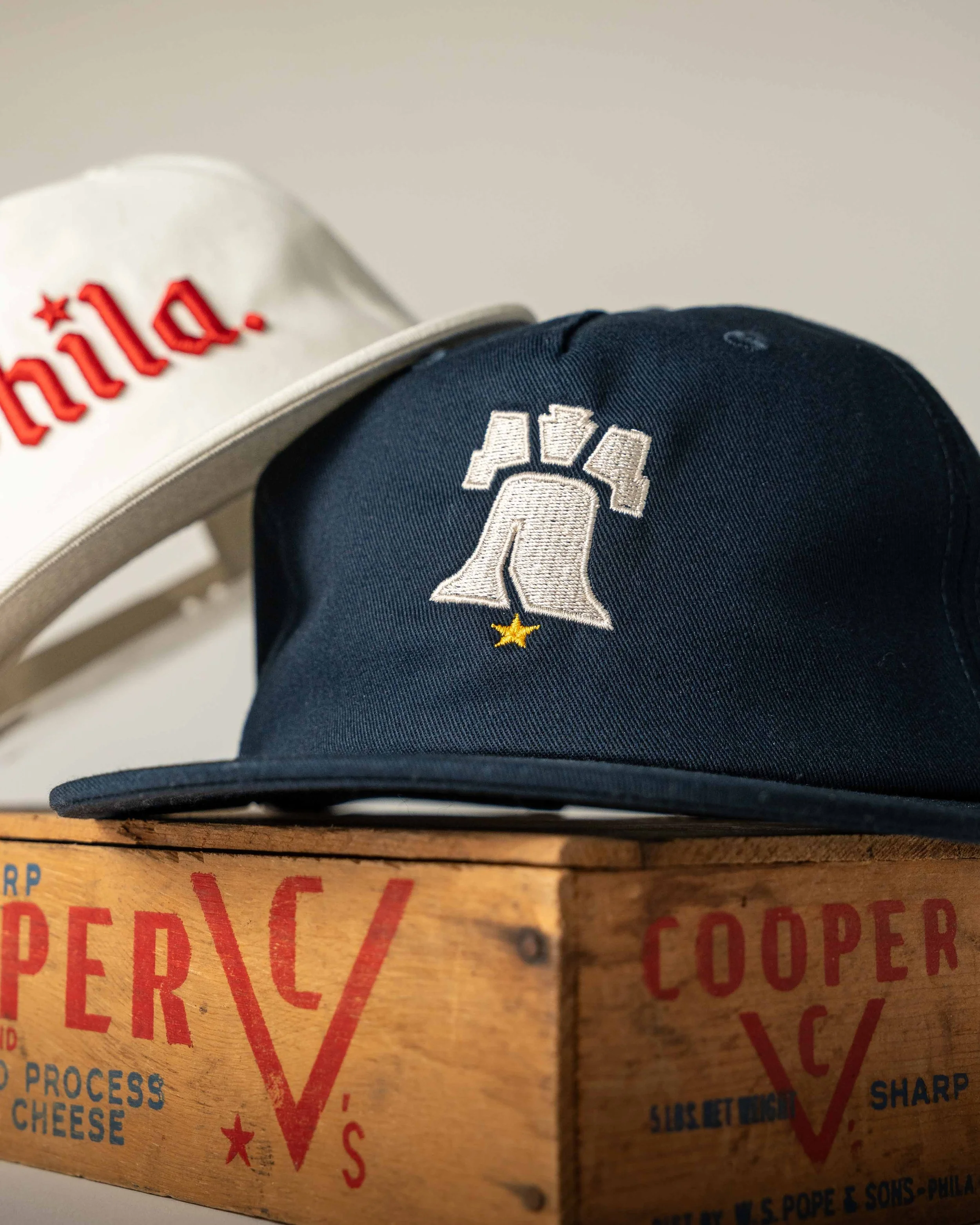
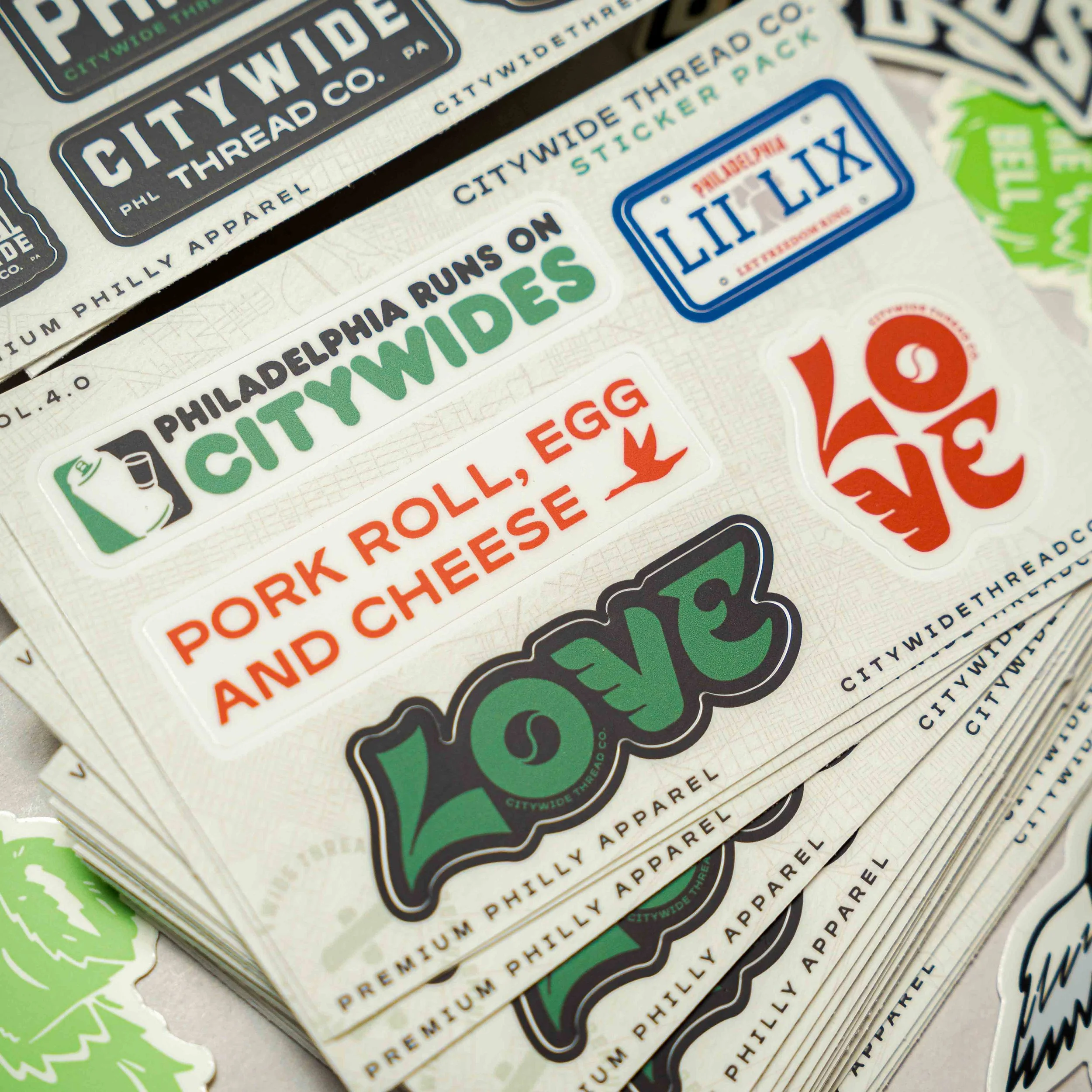
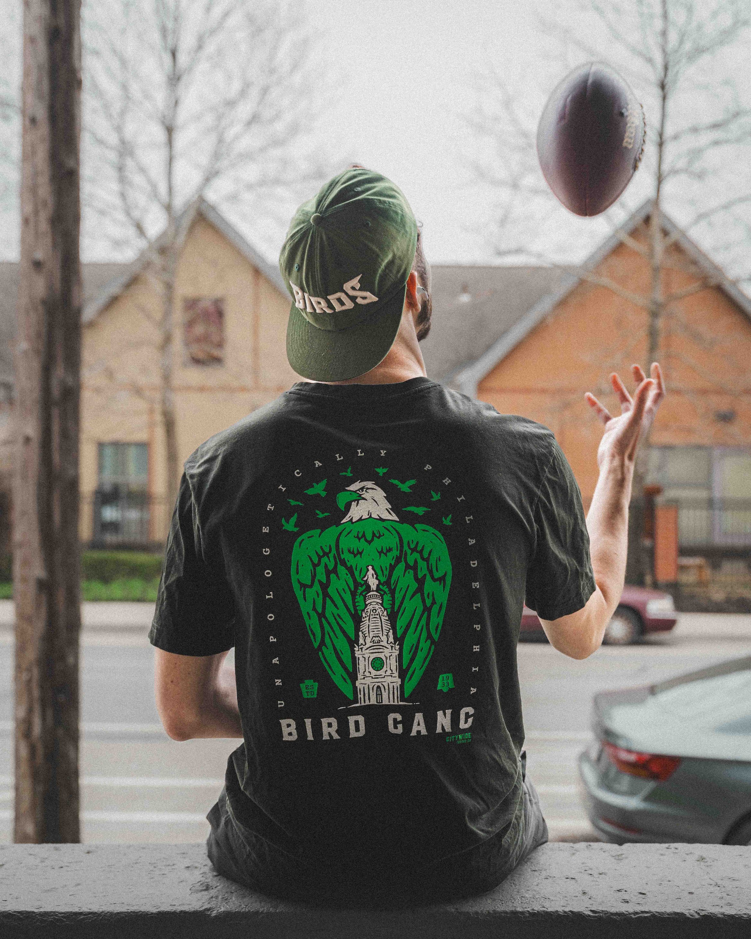
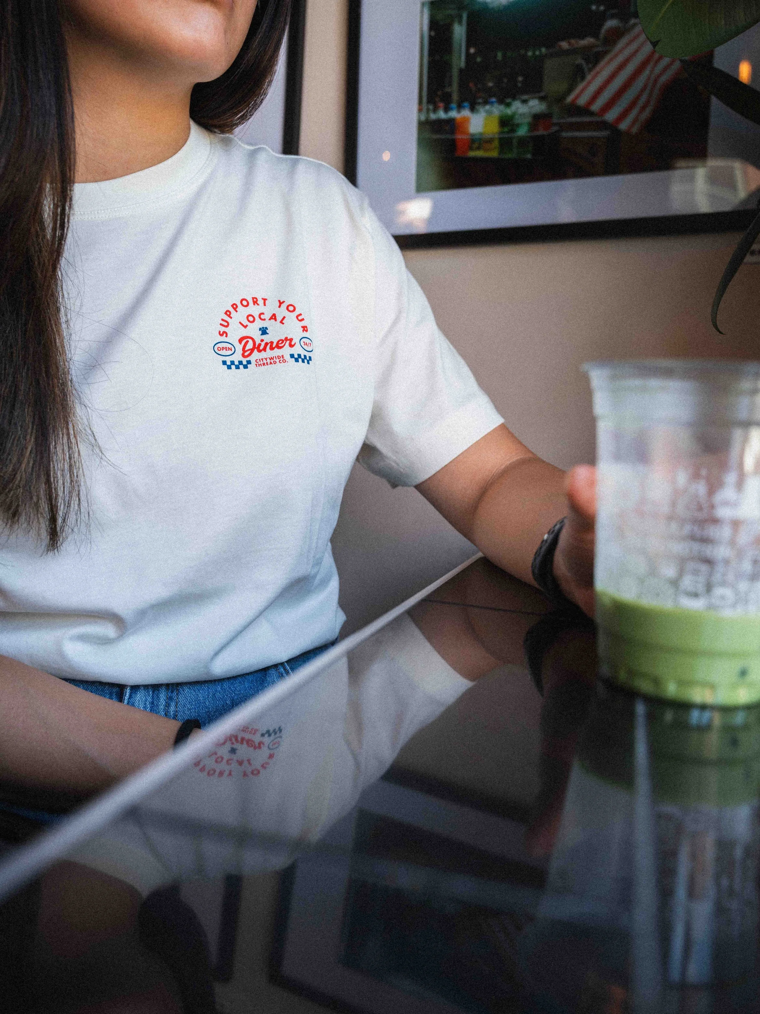
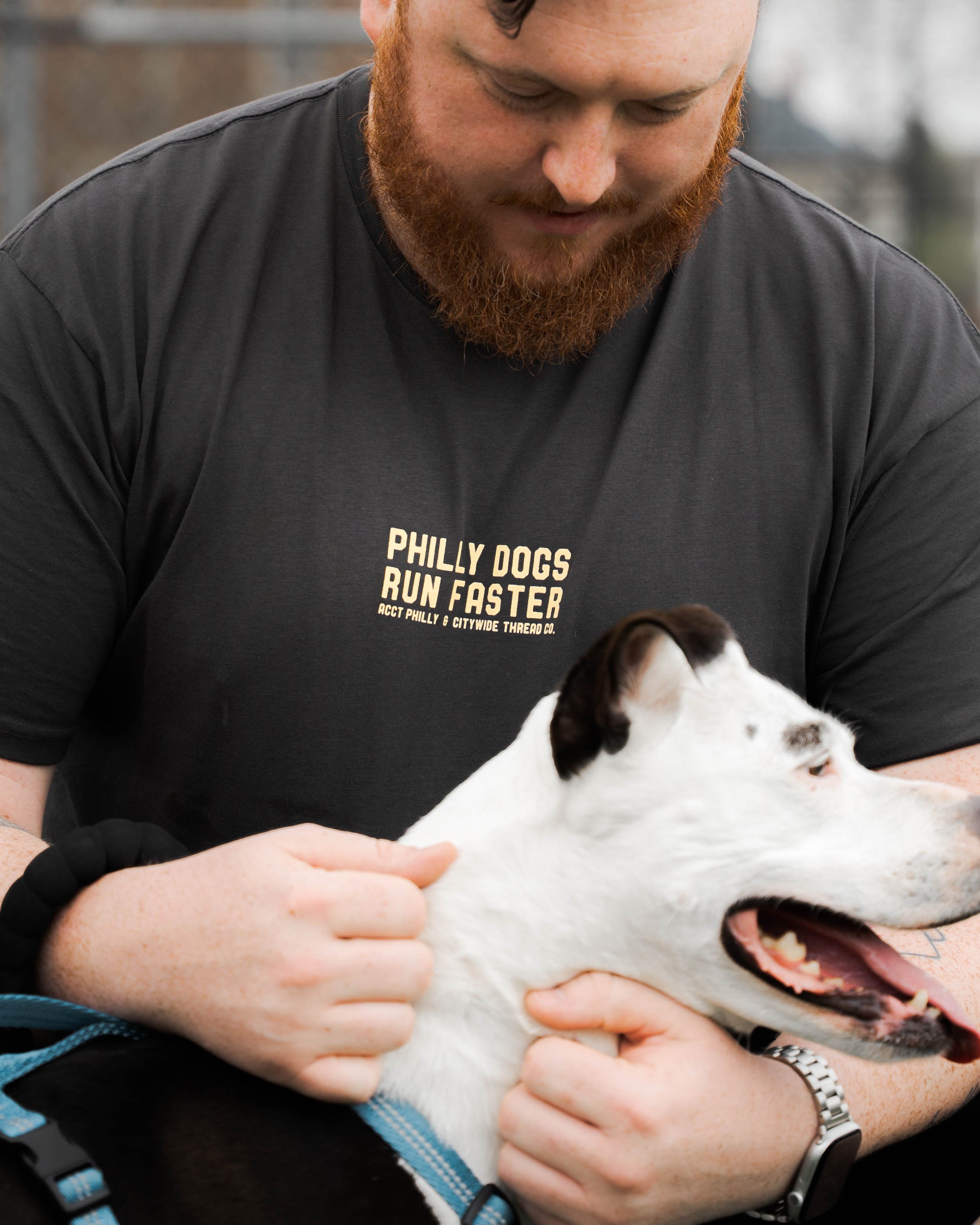
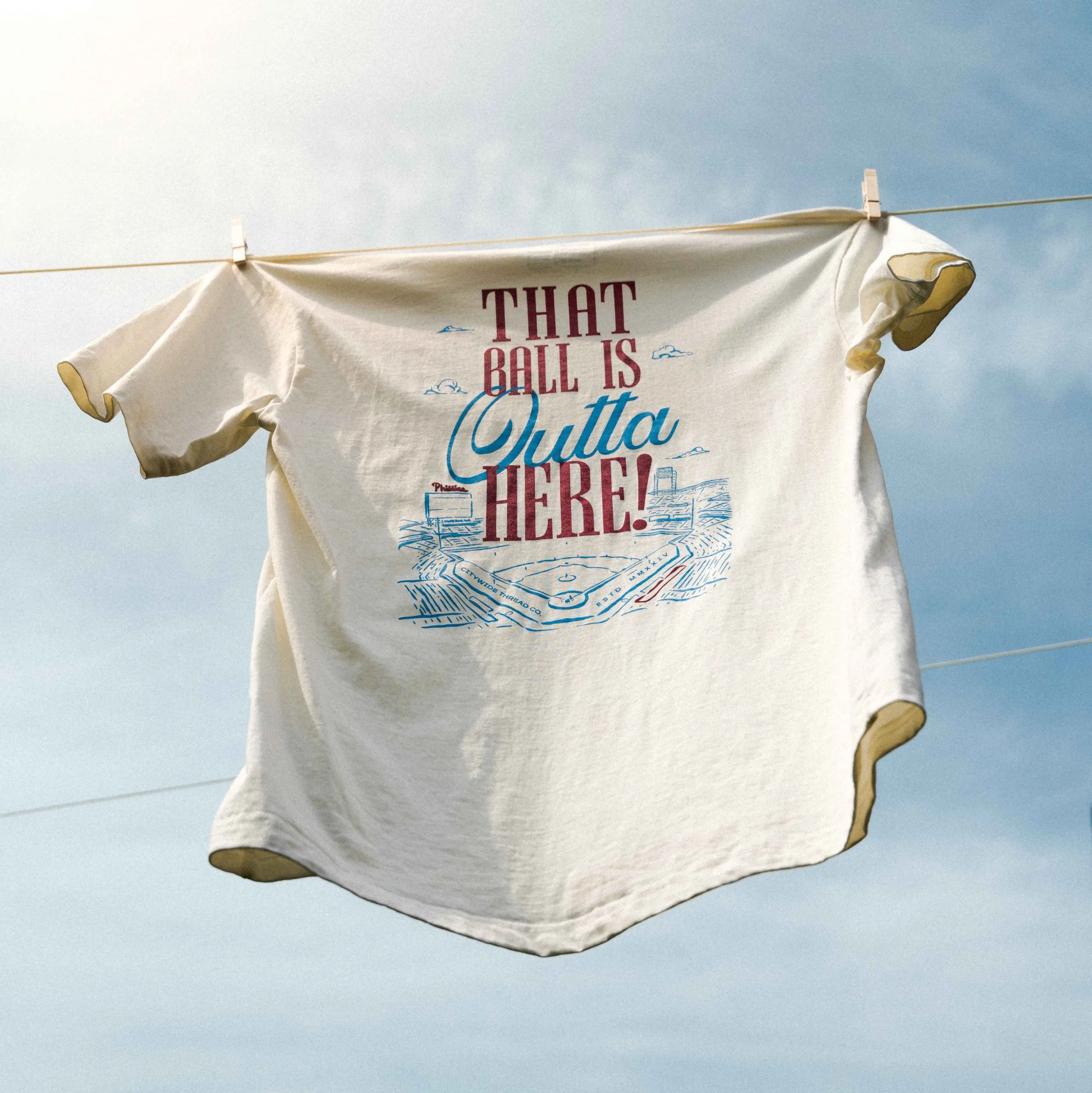
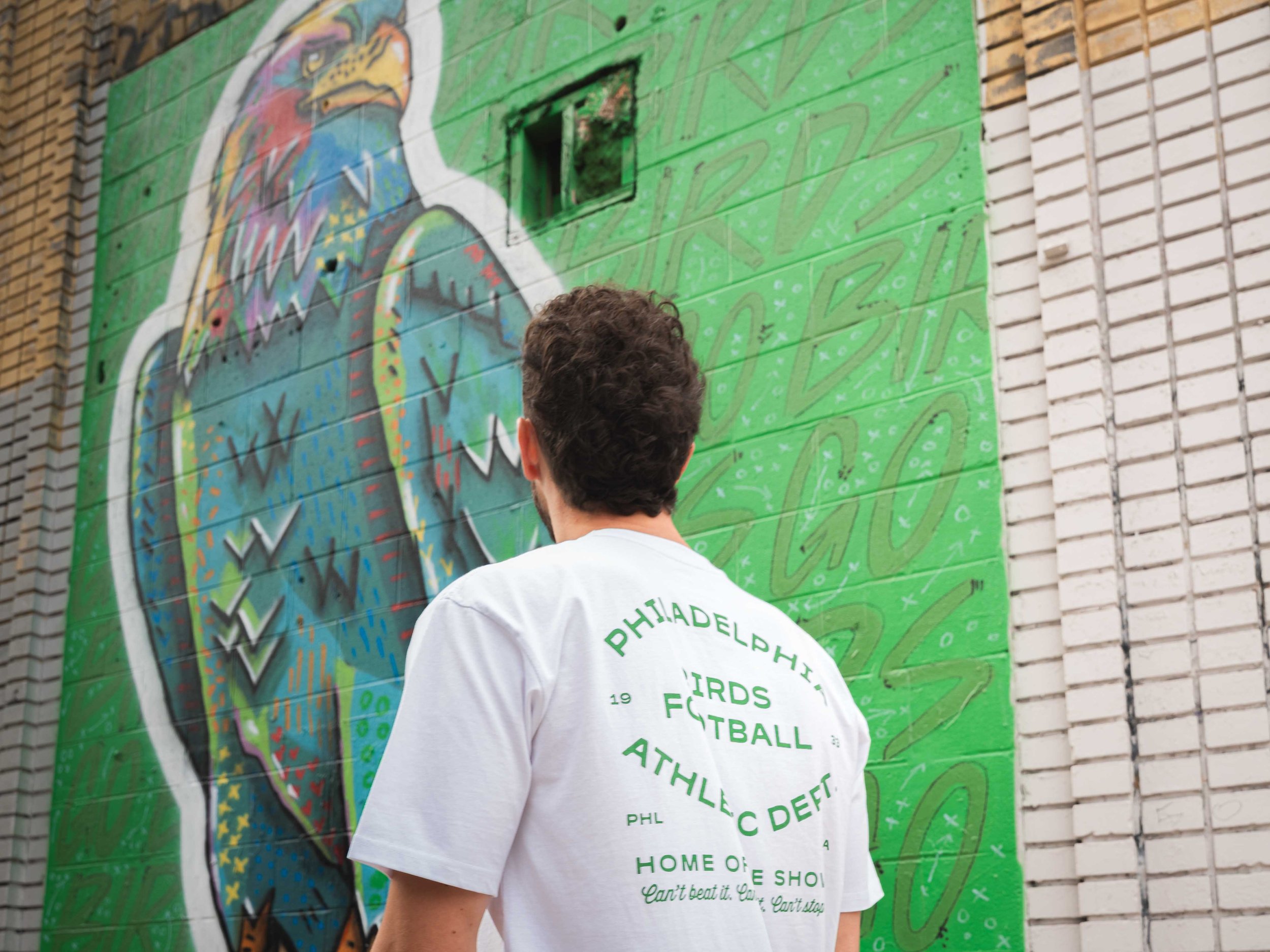
Creating the Citywide Thread Co. visual brand identity, developing designs for the printed apparel, and then capturing all those details in product photography is about as close to the complete package as you can get. I don’t always do projects of this scale, but I love seeing it all come together.